Hi Everyone,
I've mentioned a few times that presentation of content can make all the difference between a resume that gets looked at and one that is just tossed straight across to the 'no' pile without any further consideration after an quick glance.
So today's post will use a series of Microsoft Word screenshots to show you how just the simple contact details can be given different (but professional) looks without your needing to resort to using templates.
I'll use my details and give commentary along the way, so let's get started with creating.
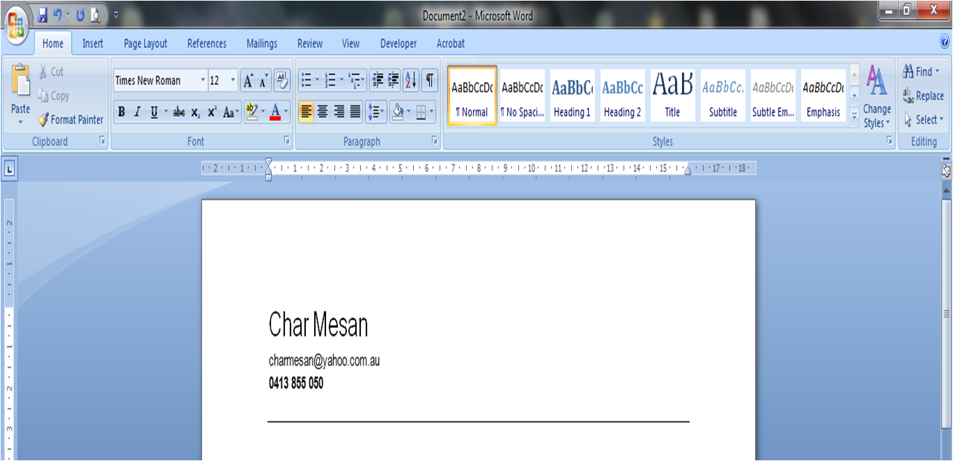
To begin with, I opened a new Word document and typed in my name, my email address and my business mobile number, using the Enter key so that each piece of information sits on its own line (Image 1.0):
 | | | | |
| Image 1.0 - Adding text to blank document |
Next, I deactivated my email address hyperlink. I did this because when the document is printed, the email address appears is lighter in colour because the hyperlink makes the text a different colour, and I am wanting to optimise my details for printing out rather than being viewed electronically, so to achieve this, I want the text to be the same as the rest of the text and I don't want the text underlined or emphasised in any way. To do this, I placed my cursor inside the email address and then right clicked my mouse button to reveal the following menu (Image 1.1):
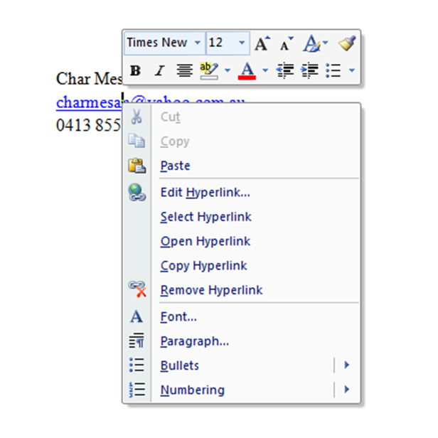 |
| Image 1.1 - Deactivating the Hyperlink |
Which results in my text now looking like this (Image 1.2):
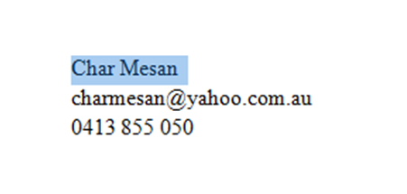 |
| Image 1.2 |
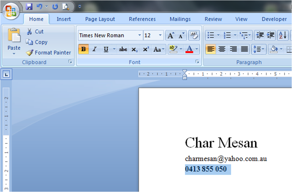
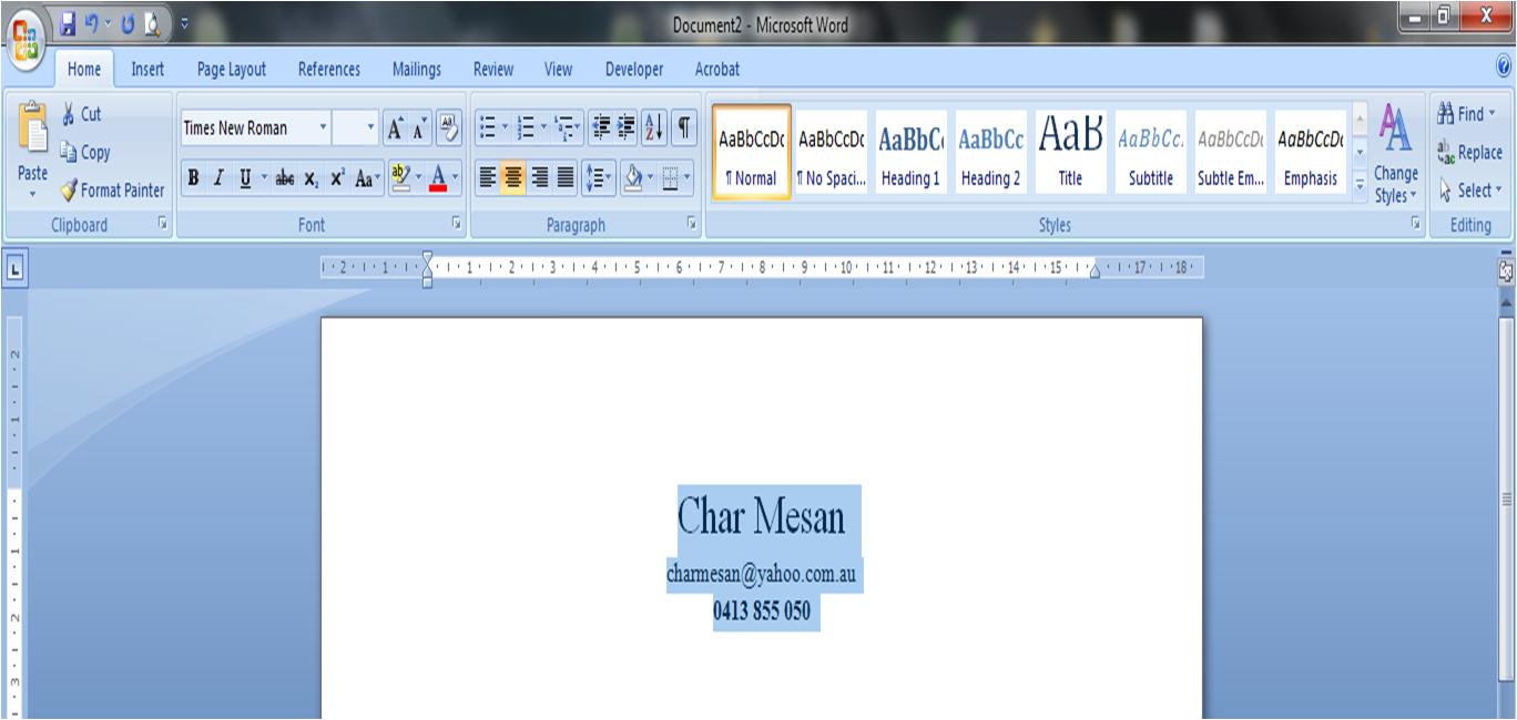
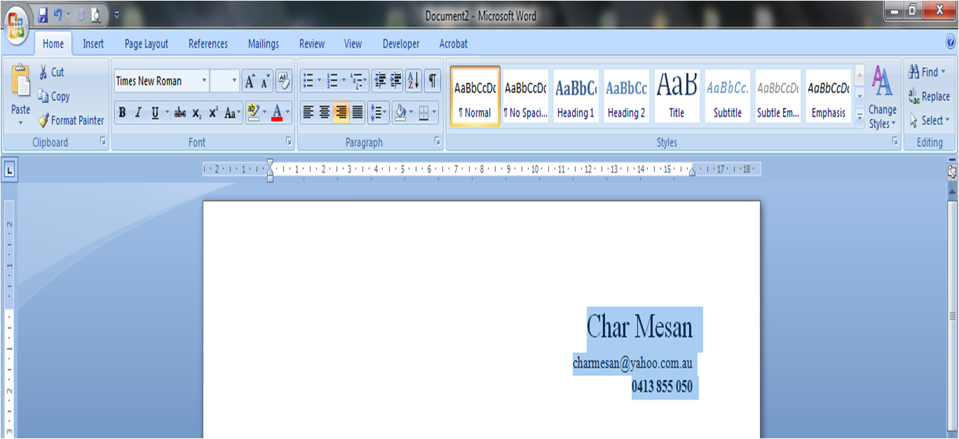
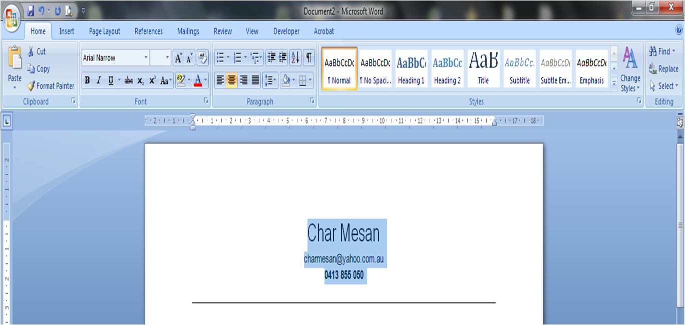
Next, I intend styling my name, so you will see in Image 1.2 that I have also highlighted my name. So that it stands out, I am going to make the text larger. The default font size is 12 pt - which is great and perfect for the body text, so I am going to make my name stand out by doubling it to 24 pt (Image 1.3):
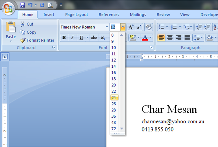 |
| Image 1.3 - Enlarging font size |
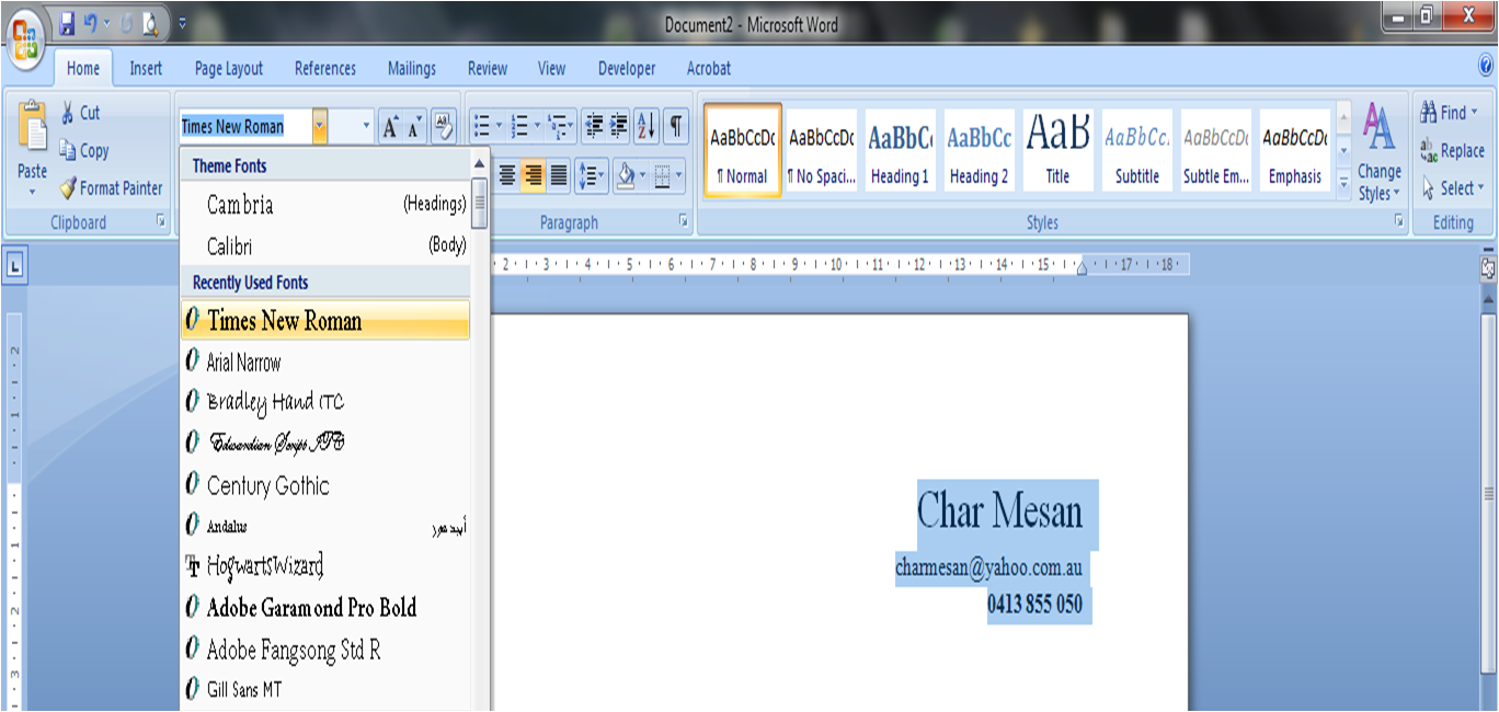
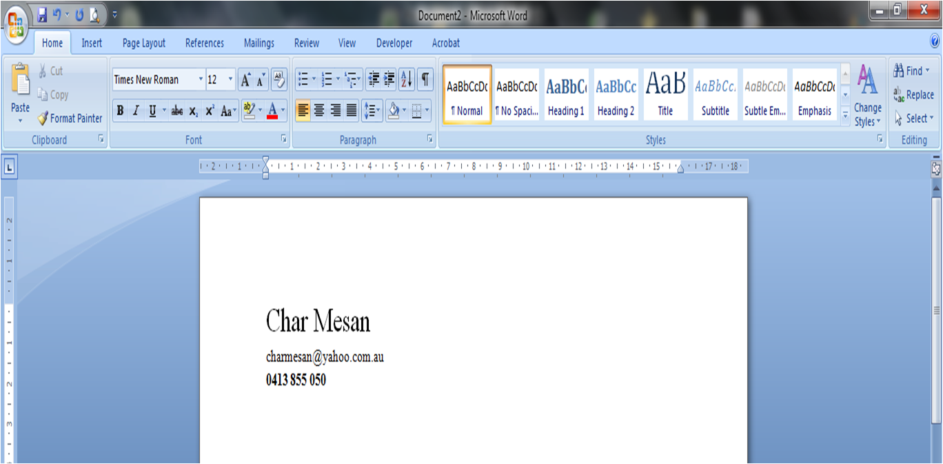
Now, please notice that I am using a professional font here - Times New Roman. Although designers hate it because it is 'boring', it is great for use in resumes, cover letters and other professional documents because it is easy to read both electronically and in print form.
I also want my contact details to stand out from the rest of the body text - I want it to be easy for an employer to call me, so I have chosen to use a combination of 1. enlarging the text with 2. bolding the text for emphasis. This means I have used up my 'no more than two emphasis' to make the text stand out from the rest, so I would need to shrink the text back to original size or un-bold it if I wanted to use a different way of emphasising, so that it doesn't suffer from 'emphasis overkill'. But I am happy with the bold enlargement (Images 1.4 and 1.5):
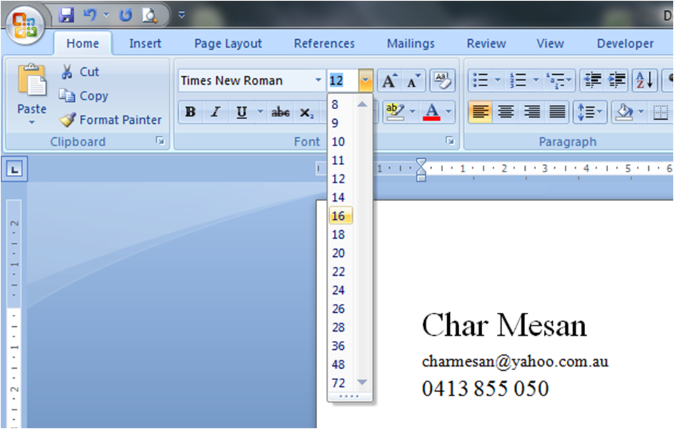 |
| Image 1.4 - Enlarging the text |
 |
| Image 1.5 - Bolding the text |
If you don't want to use Times New Roman, then you could try the look and feel of different fonts - but make sure you use a font that is easy to read and suits business usage.
 |
| Image 1.6 - Times New Roman |
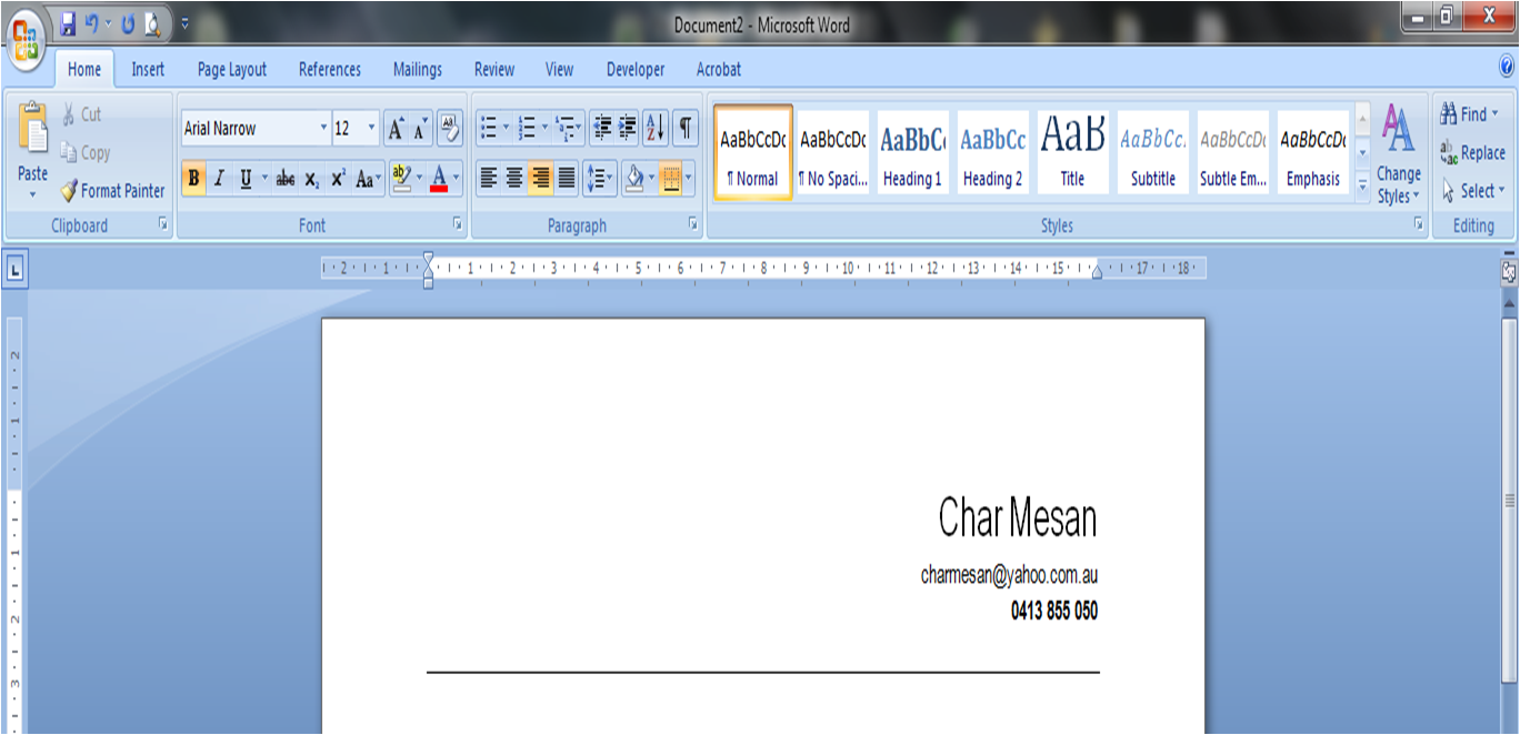
As mentioned earlier, Times New Roman is my favourite, but there are other professional serif and sans serif fonts that you could use, like Arial (Image 1.7)
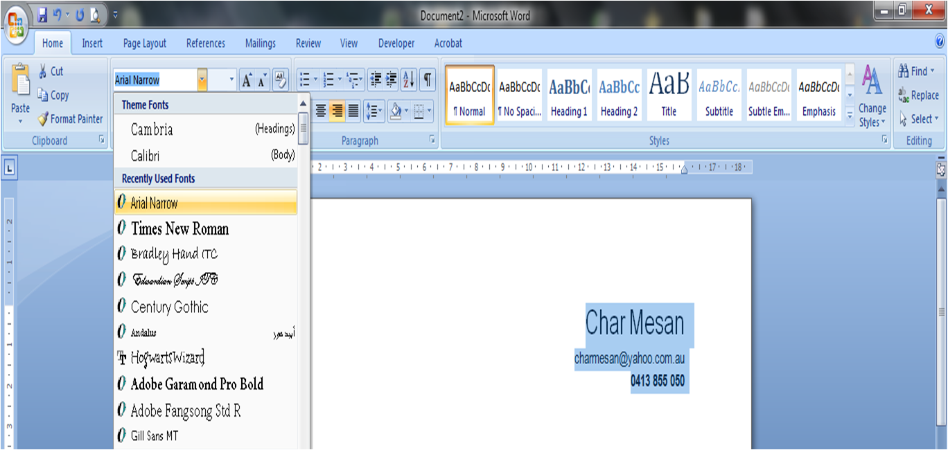 |
| Image 1.7 - Arial Narrow |
The main thing is to avoid using fonts that are hard to read, like Script and Handwriting fonts. These are great for personal and creative uses, but not so great as body text in business documents (Images 1.8 and 1.9)
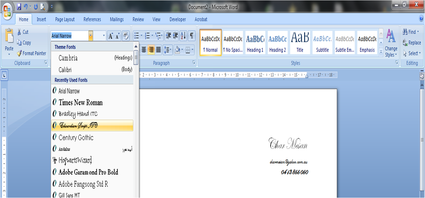 |
| Image 1.8 - Script fonts |
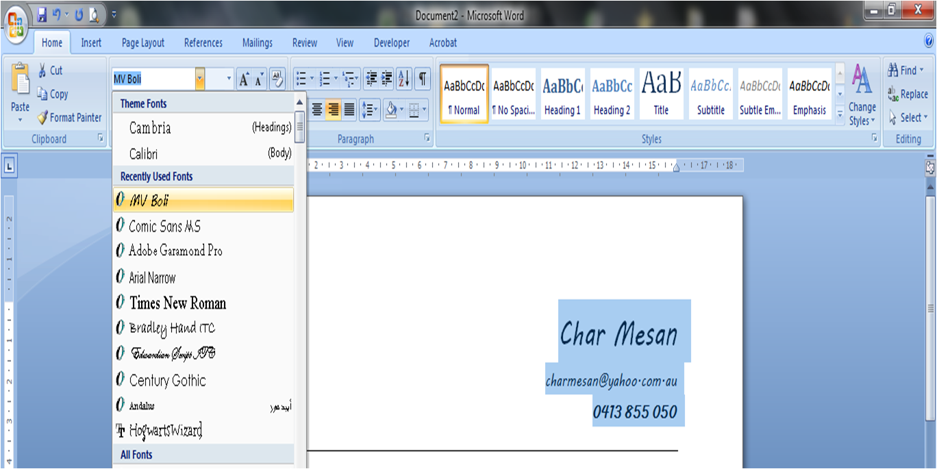 |
| Image 1.9 - Handwriting fonts |
For the rest of this tutorial post, I'll use Arial Narrow, just to give myself a bit of variety though.
Now that I have got my basic details looking right, now I can stylise my resume further by playing around with its alignment. As you can see, so far my details have been
aligned left but I could personalise the look of my resume by trying
aligned right and
centred (Images 2.0, 2.1 and 2.2.):
 |
| Image 2.0 - Aligned Left |
 |
| Image 2.1 - Centred |
 |
| Image 2.2 - Aligned Right |
I love adding a line to divide my contact details from the rest of my resume information. The reason for this is that I use a Header and Footer from the second page onwards, and I use a line in the Header and Footer so adding this line here even though it doesn't sit in the same position as the line in my Header ties the elements together unifying my design - so let's play around now with how our resume could look with the different alignments with the line 'enhancement' (Images 2.3, 2.4 and 2.5):
 |
| Image 2.3 - Left aligned with line enhancement |
 |
| Image 2.4 - Centred with line enhancement |
 |
| Image 2.5 - Right aligned with line enhancement |
I hope you can see just from this graphic intensive but short post that you can avoid using horrible resume templates and can instead use Microsoft Word features to create a unique look and feel to your resume.
With just three personal details and playing around with only alignment and a line enhancement, I have created six different looks - and could easily create even more different looks by using other features.
Just remember though, that although you want to create a unique look for your resume, don't overdo the creativity side of things.
If you liked this article, please share it with jobseekers who may be struggling, or tell them to visit my site!
Char

No comments:
Post a Comment